AI-Driven Design
Optimizing Distribution Messaging
Optimizing Distribution Messaging
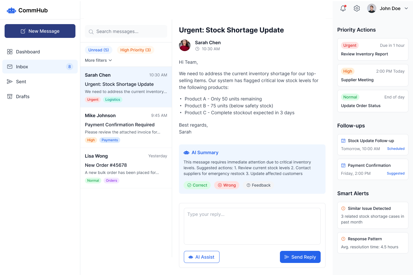
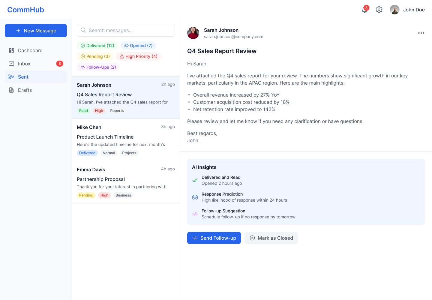
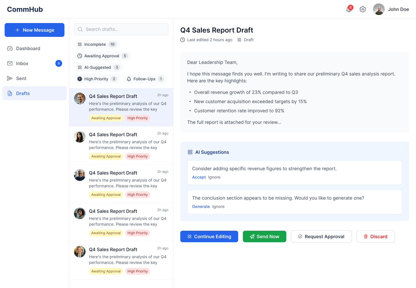
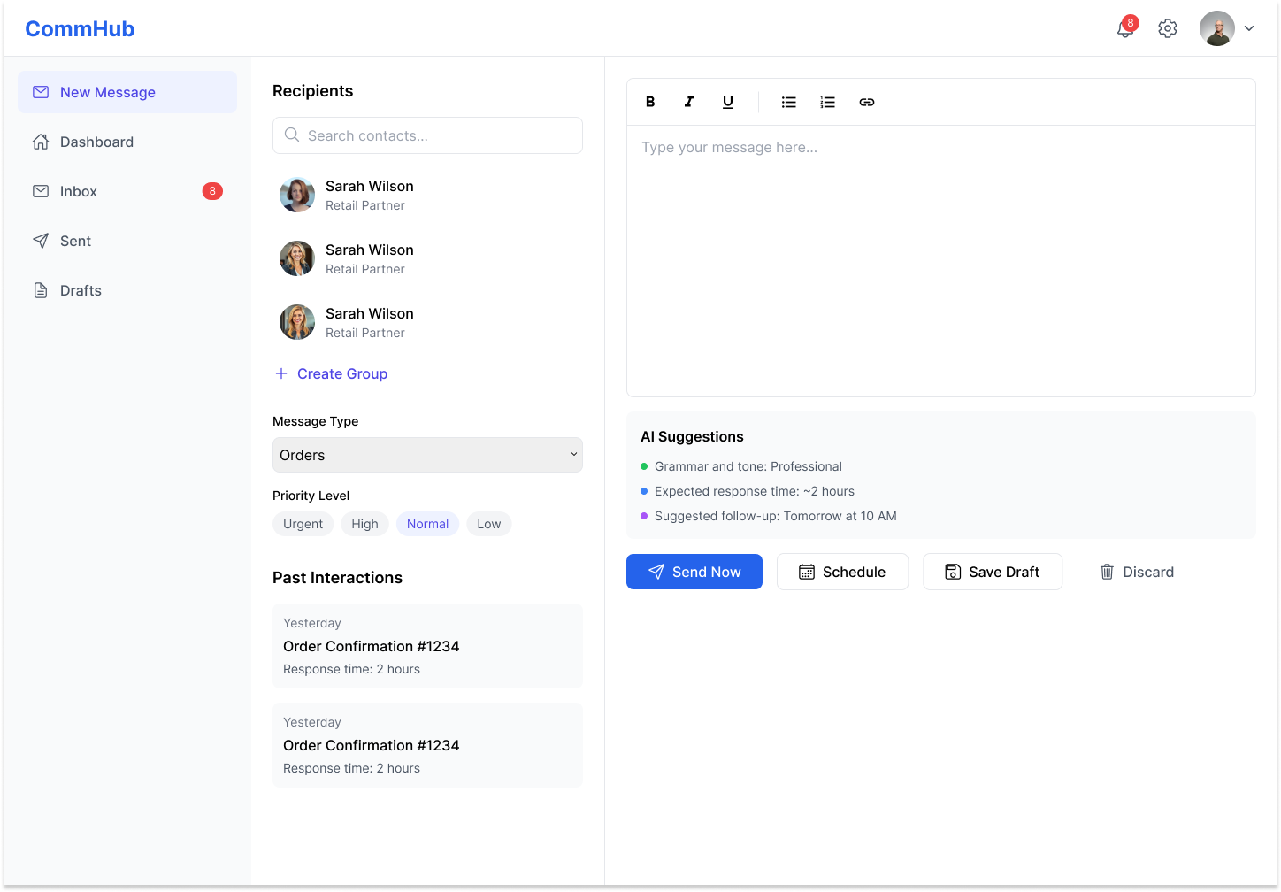
A leading distribution company launched a digital transformation initiative to improve efficiency & customer experience. One major challenge was a fragmented and inefficient messaging system between retailers and distributors, causing delays, miscommunication, and operational bottlenecks.
Team: 1 Senior UX/UI Designer + 2 Junior-Level UX/UI Designers
Duration: 4 Months [Design handoff to development]
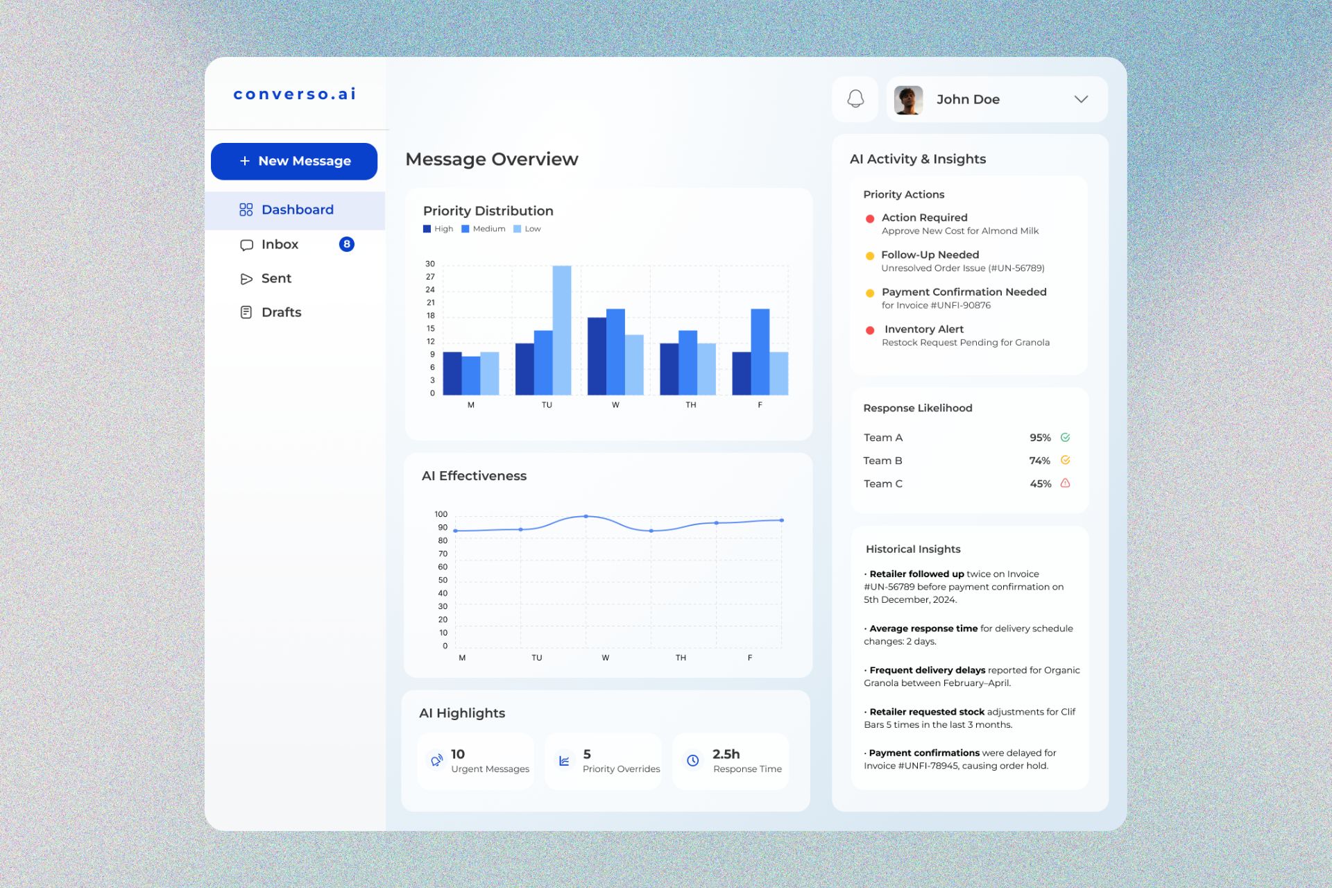
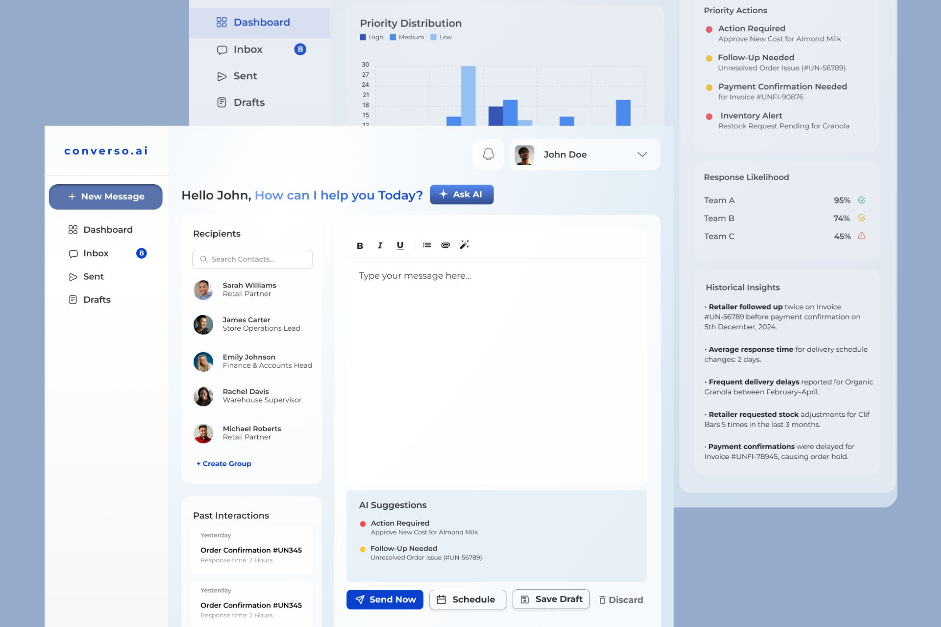
AI powered every stage of development, from backlog grooming to deployment, accelerating the process and ensuring precision. The result: a faster, more efficient platformthat showcased the transformative power of AI.
AI-assisted empathy mapping to automated design generation and faster approvals—enabled quicker design-to-code handoff.
AI-powered ranking and user feedback streamlined decision-making, reducing cognitive load.
Automated insights reduced manual tasks, enhancing workflow efficiency and user experience.
Conducted in-depth interviews with a select group of key stakeholders to explore pain points, behaviours, and goals. Insights were used to create actionable user personas with AI tools.
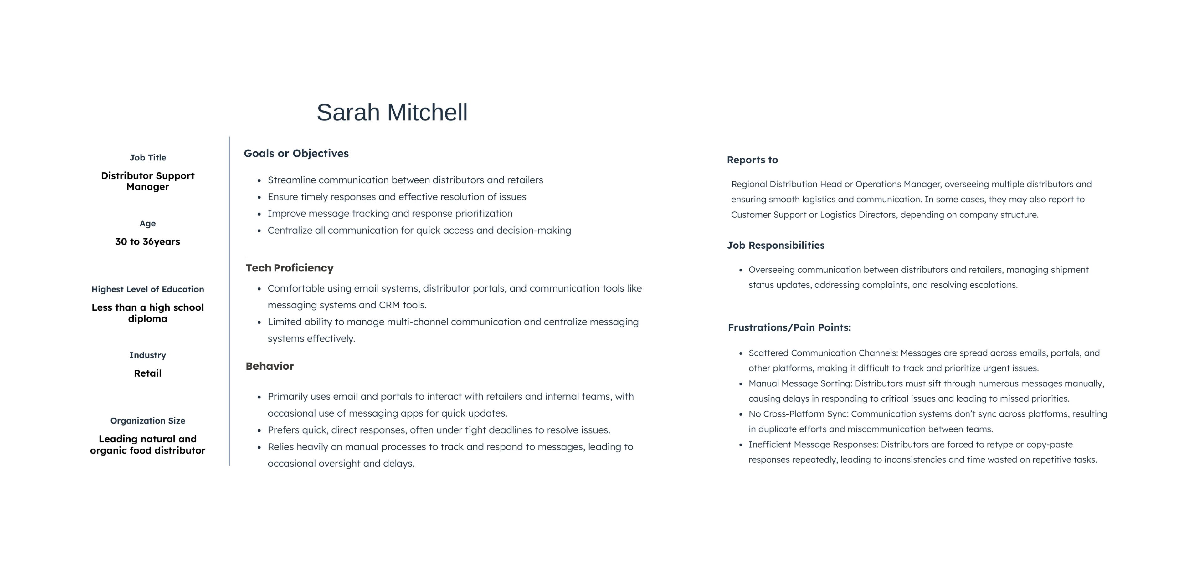
Generated using UXPRESSIA, an AI-driven customer engagement platform.
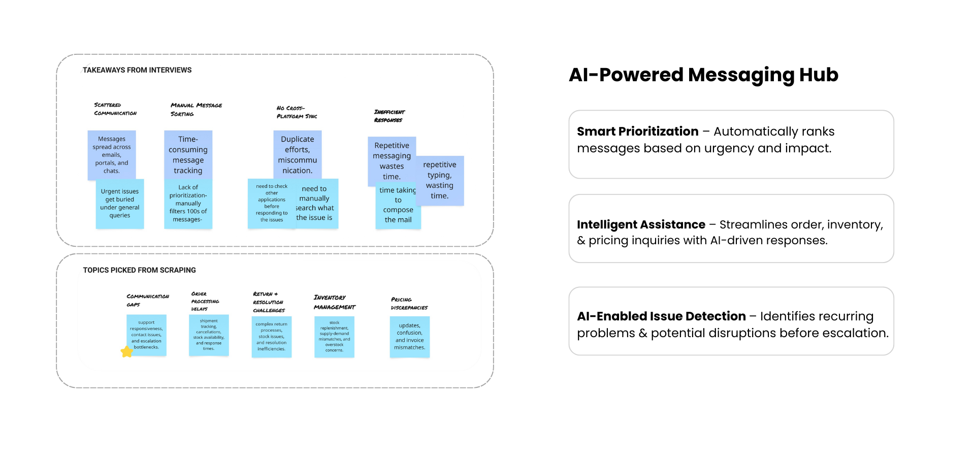
The design and development teams partnered to implement a targeted web scraping strategy, analyzing industry-specific B2B forums, support tickets, and structured industry reports. This approach enabled direct access to real, unfiltered user insights like delays, lack of visibility, platform confusion and support responsiveness were the recurring themes.
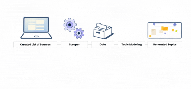
Visualizing the Web Scraping Process
Merged insights from user interviews & AI-driven topic modeling and applied AI to synthesize patterns across both sources. It uncovered a new user pain point that had emerged clearly in individual sources
| Pain Point | User Interview | Validated by Users |
|---|---|---|
| Delayed responses | Found | Confirmed (7/8) |
| Too much manual effort | Found | Confirmed (8/8) |
| No priority sorting | Found | Confirmed (7/8) |
| Hidden Operational Bottlenecks | Not Found | Confirmed (8/8) - we act when it's escalated, not when it first appears. |
Insights from previous stage were clustered to uncover key themes. With AI support, the BA drafted initial epics & user stories, later refined through stakeholder input.
Insights generated from a hybrid research approach.
In under a minute, AI generates a structured user flow,identifying inefficiencies and enhancing automation. It suggested an additional loop,integratingintelligent feedback across all stages,ensuring continuous learning and a smarter, more adaptive workflow.
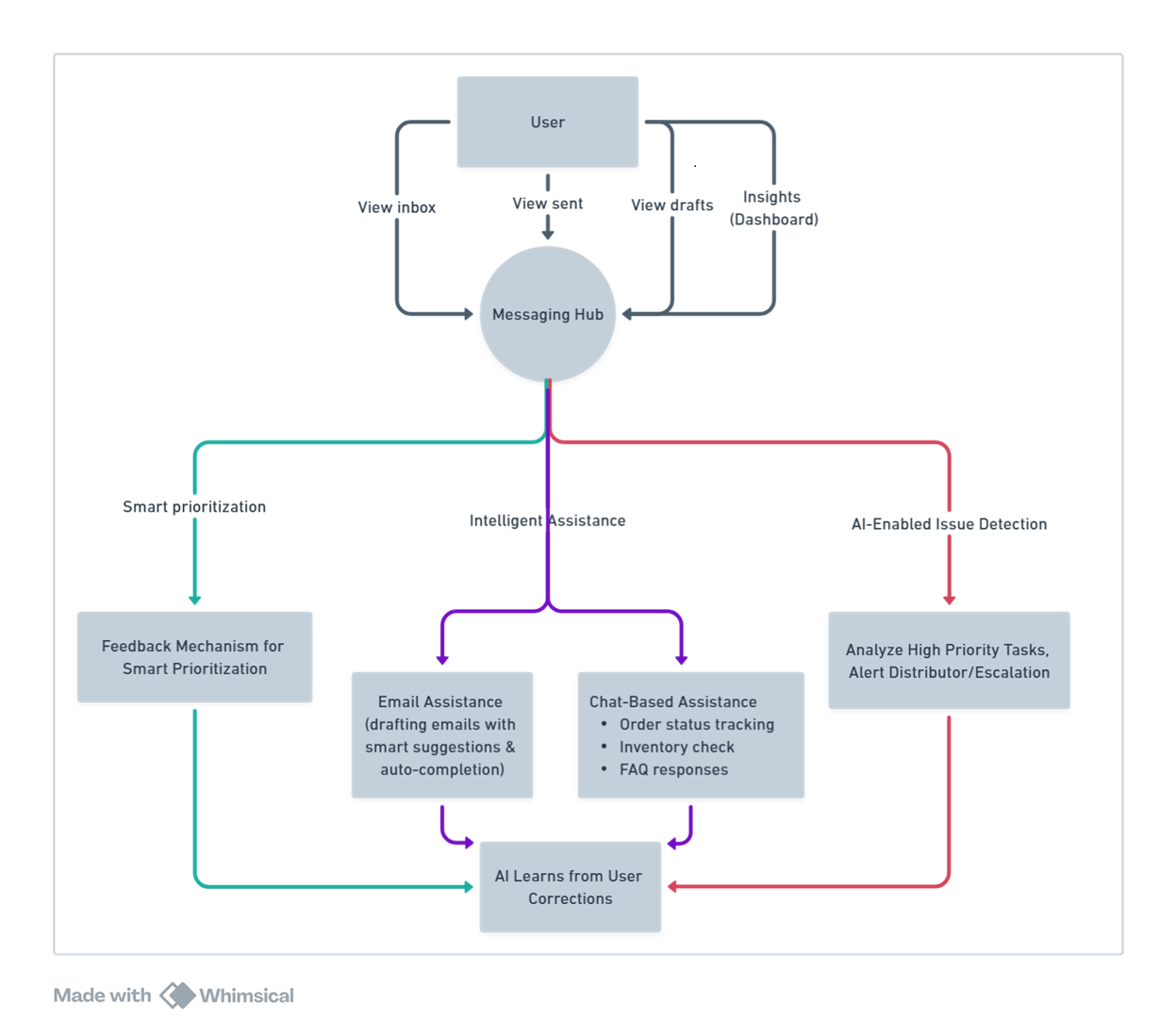
User flow diagram generated using Whimsical AI
The process began with hand-drawn wireframes, mapping out the core structureof each screen. These sketches were then transformed into detailed promptsto refine and enhance the design direction. The prompts were fed into Motiff AI, generatingeditable UI designs. This approach allowed for seamless customization and iteration, ensuring a polished, user-centric interface.
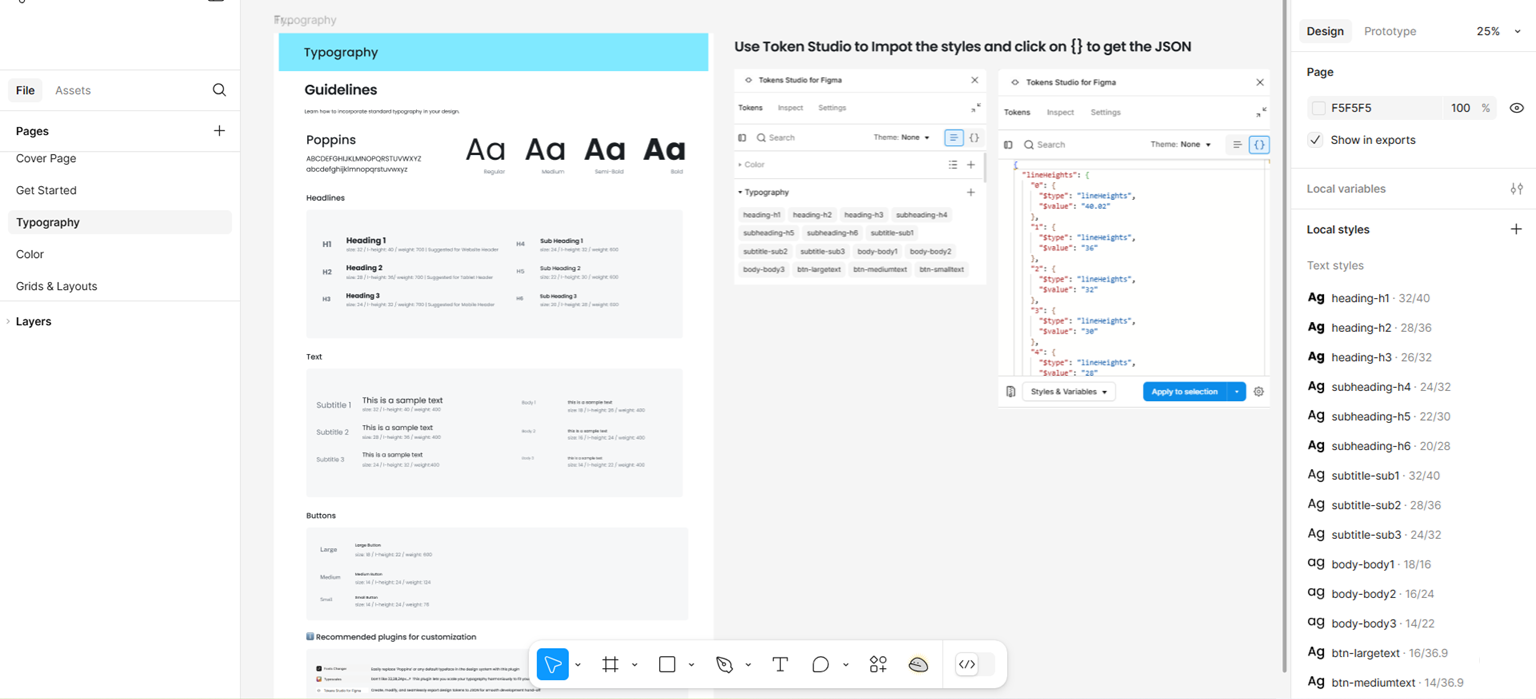
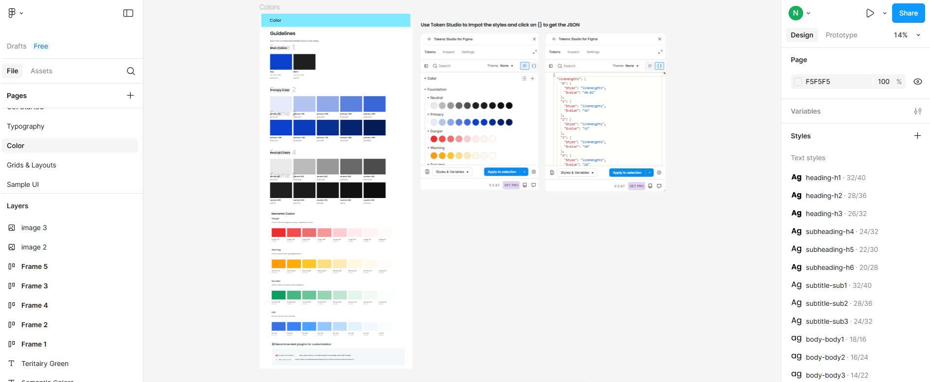
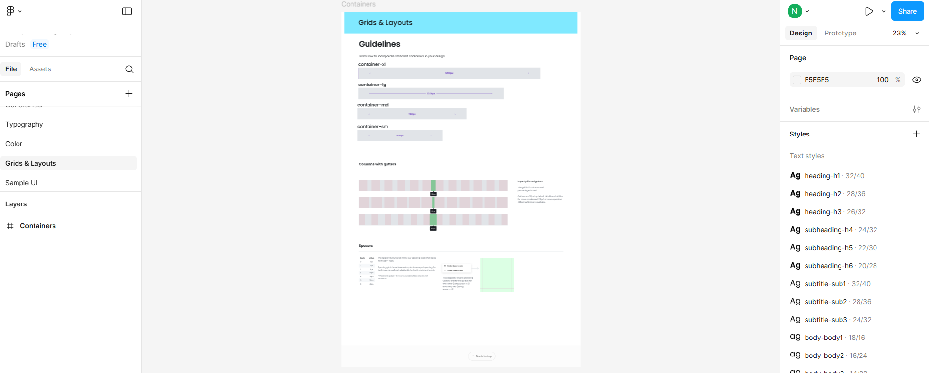
Based on the brand guidelines, AI-powered plugins in Figma were used to automate component creation,ensure consistent application of design tokens, and maintainvisual coherenceacross all elements, aligning perfectly with the brand’s identity while enabling seamless and efficient iteration.
User interaction analysis with attention maps refined key actions, while accessibility contrast checks ensured readability and compliance. AI generated insights from these evaluations guided iterative design improvements, enhancing usability through data-driven refinements.
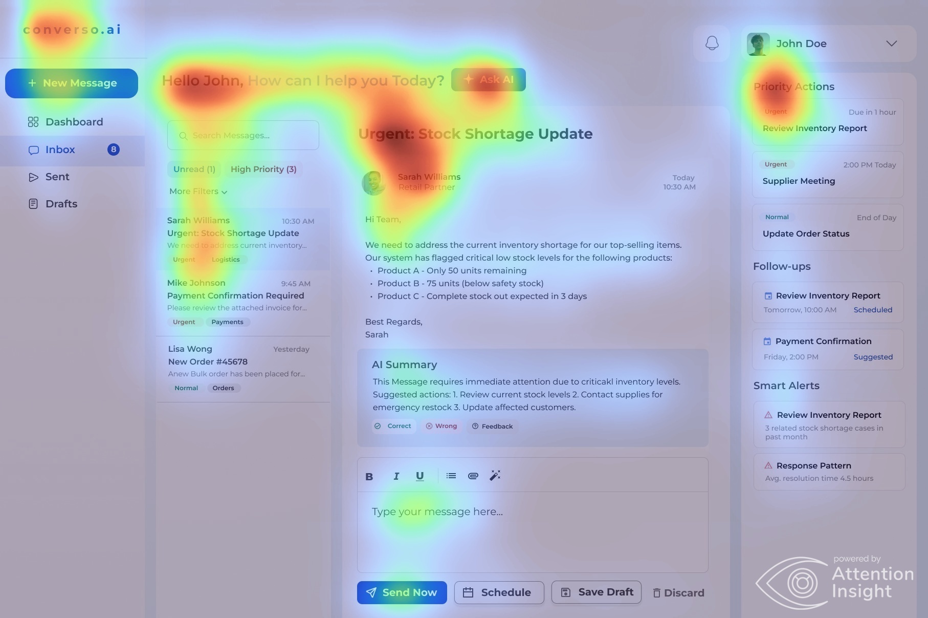
Predictive attention mapping revealed user focus areas using AttentionInsight
AI generated insights derived from heatmap analysis
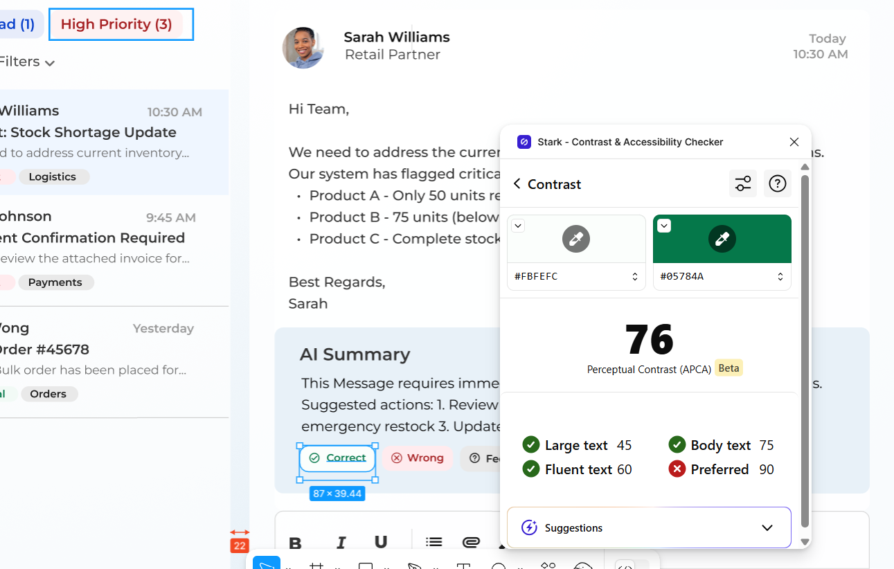
Accessibility contrast check with AI-Guided color optimization
| Testing Method | Findings | Refinements Implemented | Outcome |
|---|---|---|---|
| Visual Attention Analysis | Certain UI elements (e.g., user profile) drew unintended focus. | Adjusted visual hierarchy to direct attention effectively. | Enhanced focus on critical actions. |
| Heatmap Interaction Testing | Low engagement in sidebar menu and key buttons. | Repositioned key buttons for better visibility and interaction. | Increased user engagement by 30%. |
| Contrast & Accessibility Checks | All text and buttons passed contrast compliance tests. | Ensured stronger text-background separation in critical areas. | Improved readability and usability. |
| Cognitive Load Assessment | High information density in alert sections. | Optimized content grouping for better scannability. | Reduced cognitive overload. |
AI-assisted tools were used to accelerate the transition fromdesign to development. While this improved speed, initial outputs revealed monolithic code blocks impacting maintainability. To address this, the design was refined withclean auto layout practices, logical component splitting, and a well-defined design token system. These choices led to a scalable, developer-friendly codebase aligned with the system.
Design to Code using Builder.io
| Stage | KPI | Benchmark |
|---|---|---|
| Empathize | AI-generated insights uncovered | Identified insights not found manually, accelerating understanding by 50-70% |
| Define | AI-assisted synthesis and solution definition | 80% faster synthesis and alignment of problem-solving approach |
| Ideate | AI-generated mid-fi wireframes | 90%+ faster in generating usable wireframes directly from AI suggestions |
| Design | AI-powered design system consistency | 70% component reuse and alignment with brand consistency using AI plugins |
| Optimize | Compliant with WCAG 2.1 | 100% adherence to accessibility and touch targets using AI tools |
| Implement | Component-based code generation | 60% of code based on reusable components and design tokens using AI-assisted handoff |
“Technology empowers design, and design elevates technology.”